Welcome! It’s long overdue and has been a long time coming, but I couldn’t be happier with the results. I hope you enjoy learning, shopping, and finding inspiration on the new site and DSQ community. I’ll be adding more content in the coming months, so come back often to see what’s new. I’m especially excited to have a real home for our Sew Alongs too – be sure to subscribe for updates!
It sounds impossible, but my first website was designed during the days of dial-up internet by fellow RISD grads and partners at the design firm 2X4. A small grant from the Women’s Business Development Council was the help I needed to get the new site off the ground, and I’m thankful for their support!
The process of building a new site is not for the faint of heart. I couldn't have gotten through it without the talent and experience of Miles & Miles. Their unflagging good nature and patience made a long and painstaking process rewarding and fun. Miles & Miles also shot some of the beautiful new photography on the site and I’m excited to work with them on more projects down the road.

We relied on expert guidance from Aeolidia who provided a huge boost to our progress, and helped establish the design. I’m especially happy they encouraged me in choosing the typeface Community Gothic for the site.
Making meaningful design decisions is a part of my DNA – not just for the website but in all that I do. The details might be small and seemingly imperceptible, but I know they add up and matter. The choice of headline font for the new site needed to be just right.

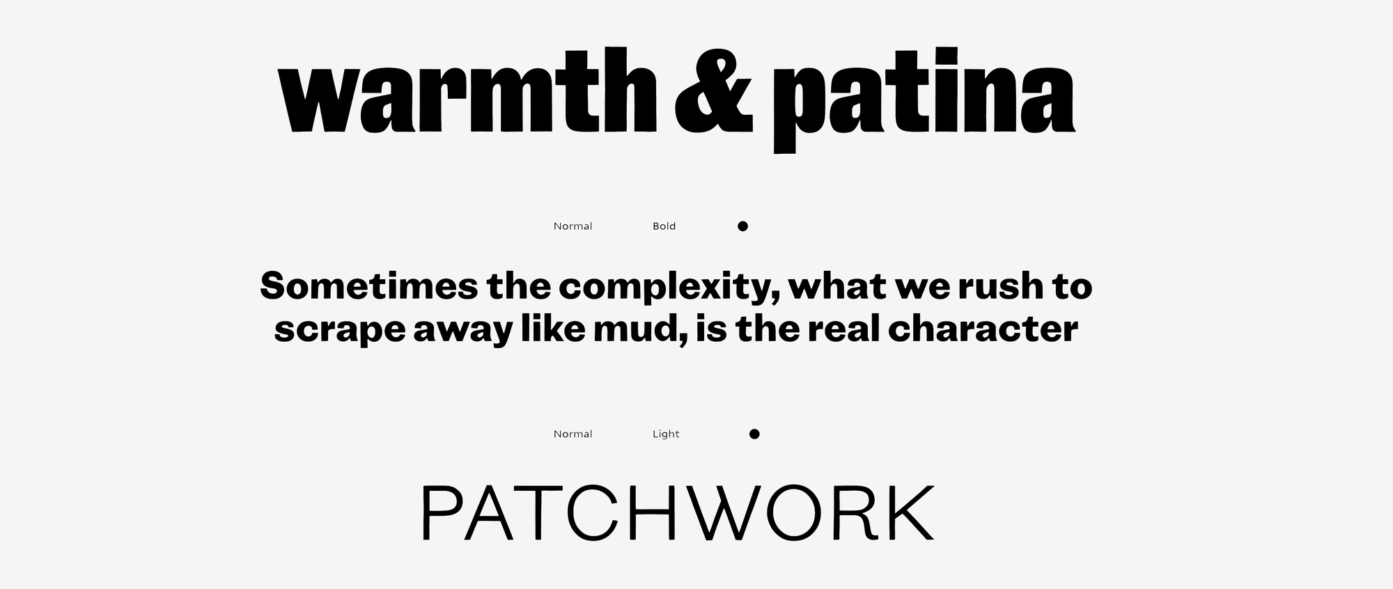
Above is a specimen page for Community Gothic, and (besides the typographic qualities I love) that page right there could be my mission statement!
Community Gothic was designed by another of my RISD buddies, Tobias Frere-Jones. Toby is one of the leading typographers of our time, and this trajectory was apparent even when we were still in art school. Toby sat next to me in our graphic design studio and encouraged me to translate my cut-paper letters into a digital typeface—Scamp—which I was able to sell to one of the many type foundries that emerged during that era.
The tale of Scamp, my first licensing experience, is a story for another time. But if you love type the way I do, I encourage you to read the thoughtful story about the development of Community Gothic, entitled “Grit and Patchwork” (!) here.
One of my favorite passages from that story:
In design, as in life, it can feel as though perfection is only accomplished via the sanding away of rough edges. We’re encouraged to remove the things in our work, or about ourselves, that feel messy or unresolved, leaving only the clean, tidy, and supposedly beautiful bits behind. Reduction as a means of revelation. But, in the course of making Community Gothic, Frere-Jones ultimately reflects that he’s come to learn that this sort of editing isn’t a given. “Sometimes the complexity, what we rush to scrape away like mud, is the real character.”
There’s a lesson there for all of us – and I am so excited you’re here and part of the DSQ Community! With our new site serving as online store, inspiration launching pad, quilting bee and archive, there’s no telling where this journey will take us!
One for the Road: If you find yourself out of your depth with a new project, don’t hesitate to reach out to those with expertise in different areas from your own!


